Assignment files
Developed by Lion Behrens, Duco Veen and Rens van de Schoot
How to elicit expert knowledge and predictions using probability distributions
First Exercise: Elicit Expert Judgement in Five Steps
⇒ How to compare predictions of different experts using DAC values
⇒ Second Exercise: Exploring Expert Data Disagreement
Behind the scenes: Understanding the computation of DAC values
Third Exercise: Understanding Expert Data Disagreement
This tutorial provides the reader with a basic introduction to comparing expert predictions using the software package R. In the first exercise of this series, you have learned how to elicit knowledge and predictions of a single expert in form a probability distribution. If you haven't completed this exercise yet, please do so first by clicking on the link above. In this second exercise, you will be guided through some R code that allows you to compare the performance of different experts once their predictions are elicited and the true data is known. Open your version of R or RStudio to begin the exercise.
Introduction
After having been founded as a young start-up company in 2015, DataAid is looking back on three successful years in which the company's turnover and its number of employees could both be increased. Based on its performance in the first three years, you predicted the company's total turnover for the year 2018 in the first exercise of this series.
Exercise
a) Here, the turnover of the company's average employee is of interest. In order to transform your prediction of the company's total turnover and this value's standard deviation into its counterparts for the average employee, divide both values by the number of members in 2018 (n=16). The value for the distribution's skewness stays the same and can just be taken over from Exercise 1.
b) Store your predictions in an object called 'you' by executing the following code with the values you obtained in a).
you <- matrix(c(your_mean,your_sd,your_skewness),ncol=3)
Next to you, three fictive experts predicted the average employee's performance in 2018. Their predictions can be stored using
expert1 <- matrix(c(14500,1100,.8),ncol=3)

expert2 <- matrix(c(15500,3000,1.8),ncol=3)

expert3 <- matrix(c(19000,3500,1.1),ncol=3)
Finally, merge your and the other experts' predictions into one single matrix, with one row per expert. Since your predictions are stored in the fourth row, you will later be labeled as Expert 4. The means are displayed in column 1, the sd's in column 2, and the skewness in column 3.
experts <- rbind(expert1,expert2,expert3,you)
c) In the first exercise, you already inspected the company's individual and overall turnover rates from 2015 to 2017 (Table 1).
Table 1: Individual and Overall Turnover Rates
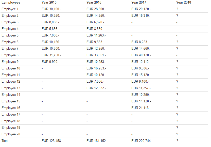
Generate the true data for 2018 that has been missing so far using the following code.
set.seed(11235)

Y2018 <- rep(NA,20)

Y2018[c(1,2,6,7,9:20)] <- rnorm(16,17000,5000)
d) Finally, compare the prediction performance of you and the other three experts by calculating the respective DAC values. To do so, install and load the package DAC from CRAN and run the DAC_Uniform command.
install.packages("DAC")

library(DAC)

set.seed(81325)

out <- DAC_Uniform(data = na.omit(Y2018),bench.min = 0,bench.max = 30000,experts = experts,lb.area = 0,ub.area = 30000,step=.1)
The DAC scores are calculated by comparing the respective predictions to the performance of an uninformative benchmark prior. If an expert performs better as the uninformative prior (thus if his/her divergence is smaller than the one of the Benchmark prior), its DAC score will be smaller than 1. For those who perform worse, the DAC score will be larger than 1. The expert with the smallest DAC score predicted the true data the best
Look at the output of the DAC_Uniform function. Did you perform better as the three fictive experts?
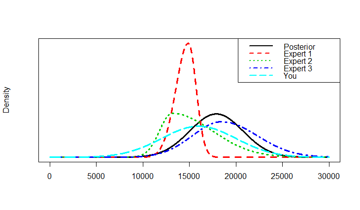
e) You can also visually expect your predictions against the actual data. Do so by running the following commands.
x <- seq(from=0,to=30000,by=.1)densities <- cbind(dnorm(x,out$posterior.distribution[1],out$posterior.distribution[2]),
dsnorm(x,experts[1,1],experts[1,2],experts[1,3]),
dsnorm(x,experts[2,1],experts[2,2],experts[2,3]),
dsnorm(x,experts[3,1],experts[3,2],experts[3,3]),
dsnorm(x,experts[4,1],experts[4,2],experts[4,3]))matplot(x,densities,type="l",yaxt="n",ylab="Density",xlab="",lwd=3)
legend("topright",c("Posterior","Expert 1", "Expert 2","Expert 3", "You"),lty=1:5,col=1:5,lwd=2)
Your output might look something like the figure below. The black line represents the true data distribution that was observed in the year 2018. The colored lines depict your and the other experts' predictions. The fewer the divergence between the true and a certain predicted distribution, the smaller will the respective DAC value be.
Conclusion
This exercise Exploring Expert Data Disagreement taught you the tools to numerically and visually compare the predictions of different experts using DAC values. If you are interested in a deeper understanding of how these values are computed, see the third and last exercise of this series: Understanding Expert Data Disagreement
References
Other tutorials you might be interested in
First Bayesian Inference
-----------------------------------------------------------
The WAMBS-Checklist
MPLUS: How to avoid and when to worry about the misuse of Bayesian Statistics
RJAGS: How to avoid and when to worry about the misues of Bayesian Statistics
Blavaan: How to avoid and when to worry about the misuse of Bayesian Statistics